Architectural Contrasts: Finding Harmony in High-Intensity Spaces
New York is a city that shouldn’t work – at least not on paper. Where else do you find gilded cornices and graffiti-covered facades sharing the same block? Sleek, mirrored towers reflected in hand-laid brick? Steel-framed lofts just steps from Beaux-Arts lobbies?
But somehow, in this city of contradictions, it works beautifully. The tension between eras, textures, and energies becomes its own form of harmony.
As I move through these spaces – historic hotels, converted warehouses, quiet lobbies tucked behind loud streets – I find myself thinking about what contrast really means in design. It’s not just about old versus new, rough versus polished. It’s about crafting a layered experience that acknowledges the past while making room for what’s next.
Letting Things Breathe
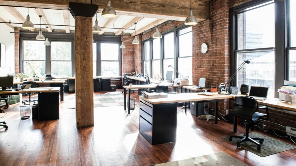
One of the most moving interiors I stepped into was completely quiet. Not minimal in the trendy sense – just considered. Exposed beams overhead, centuries old, were left raw. Below them, an angular sofa sat in quiet contrast, its lines clean but not cold. There was nothing excessive, and yet every choice felt rich.
Contrast here wasn’t about clashing – it was about letting elements breathe on their own terms. The old was allowed to show its age. The new didn’t try to imitate. And in that space between tension and respect, something elegant happened.
Takeaway for your space: You don’t have to resolve every difference. Sometimes beauty comes from not blending, but from the confidence to let each element hold its own space.
Materials That Speak Across Time
What struck me most in many NYC interiors wasn’t the furniture – it was the finishes. Walls that had been stripped back to brick weren’t seen as unfinished. They were framed, celebrated. Floors bore the marks of age, and those imperfections were lit intentionally.
Then, beside these grounded, textural backdrops, you’d find luminous glass, weightless fabrics, or sculptural lighting floating above the scene. The materials weren’t speaking the same language – but they were listening to each other.
Takeaway for your space: Start with relationship, not rules. Ask how one material supports or challenges the next. Rough with soft. Heavy with light. Old with new. That’s where nuance lives.
Stillness in the Middle of Contrast
There’s a quiet intimacy in spaces that balance intensity. In one café, I sat beneath a coffered ceiling that belonged to another century. The walls were matte black. The tables were glass. A single sculptural light hung overhead like a thought bubble. The effect wasn’t dramatic – it was calming.
This is what New York interiors can teach us: contrast doesn’t have to be loud. It can be meditative. It can make you pause.
Takeaway for your space: Don’t chase harmony through sameness. Find it in deliberate difference. When contrast is intentional, it creates clarity.
Final Thought: Contrast Is a Kind of Conversation
Design isn’t about erasing tension – it’s about shaping it. High-intensity environments like New York don’t dilute their differences; they orchestrate them.
At Reflected Spaces, that’s what I aim to do: create rooms where materials, eras, and functions speak to each other with clarity and care. Because when a space holds contrast well, it doesn’t feel torn. It feels layered. Honest. Alive.

Anna
April 18, 2025