How Paint Transforms a Room
You don’t always need more space. You just need to see your space differently.
Paint is one of the simplest, most affordable, and most underestimated tools in interior design. A single coat can make a ceiling feel higher, a narrow room feel balanced, or a quiet corner feel alive. And while color is often talked about as “a mood,” it’s also about perception – about how your brain reads size, proportion, and light.
This post is about how to use paint as a spatial tool – and how even subtle changes can completely reframe the rooms you live in.
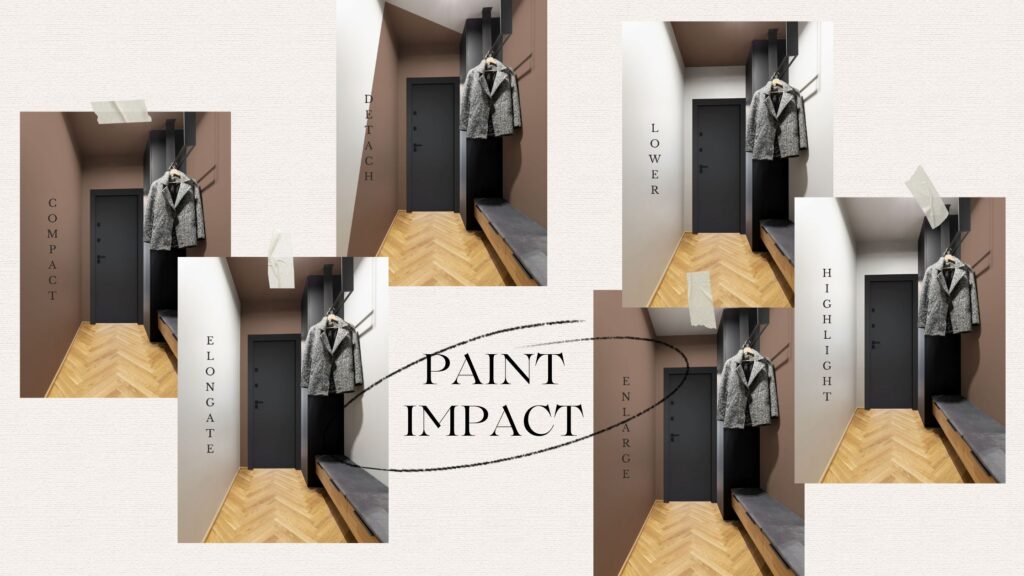
Paint Can Expand, Contract, Raise, or Ground a Space
Color has direction. Warm tones like terracotta and mustard feel like they’re coming toward you. Cool tones like soft blue or sage feel like they’re receding. Light colors tend to open a space up. Darker tones can make it feel more intimate – or more dramatic, depending on how you use them.
Some visual tricks:
- Want your ceilings to feel higher? Paint them a lighter tone than the walls – or the same shade in a flat finish to let the edges disappear.
- Want to create a cozy, cocooning space? Paint all walls and ceiling in the same color.
- Want to make a narrow room feel more balanced? Paint the short end walls in a darker color to bring them visually forward.
Small shifts in tone can create big shifts in perception – without ever changing your floor plan.
Color Changes How You Feel in a Room
Beyond what your eye sees, color affects how you move, rest, focus, and even connect.
- Greens bring a sense of calm and natural balance – perfect for bedrooms, transitional spaces, or work areas.
- Deep blues often create a cocoon-like focus – great for studies or quiet corners.
- Yellows and soft terracottas bring a gentle lift in energy – ideal for kitchens, morning rooms, or small entries.
- Dark, moody hues (plum, charcoal, forest) can actually make a small room feel larger if they absorb visual boundaries and let the edges soften.
Every space has its own rhythm. The key is matching the color to the function and feeling you want – not just the trend you’re seeing.
Finish Matters, Too
Most people stop at choosing the right color. But how that color reflects light is just as important.
- Matte finishes absorb light, making colors appear deeper and softer – great for walls where you want warmth and richness.
- Eggshell or satin finishes add a bit of reflection, which can subtly brighten darker colors without washing them out.
- Gloss finishes bounce light and attention – best used sparingly on trim, cabinetry, or architectural details.
This is often where the decision really comes together: the tone is just one layer – the texture of light is another.
Final Thought: Small Shift, Big Impact
You don’t need a renovation to make your home feel renewed. Sometimes, it’s a brush, a sample pot, and an hour of your day.
Whether you want more focus, more softness, or just a fresh perspective – paint can get you there. Thoughtfully. Beautifully. And without ever moving a single wall.
That’s the kind of transformation I create at Reflected Spaces – through intention, not excess.

Anna
May 2, 2025